Summary: Screenshots are the single highest-impact conversion lever on an App Store product page.12 This guide covers the storytelling, social proof, and visual design principles behind high-converting App Store screenshots. Based on real studies and App Store data, these techniques help ButterKit consistently achieve a 10%+ conversion rate.
Over 20 years as a Design Engineer & Researcher, I’ve had the chance to build a lot of screenshots and marketing projects, run plenty of A/B tests, and was fortunate enough to receive an Apex GOLD design award along the way. Art styles change, but the core principles for effective storytelling are timeless.
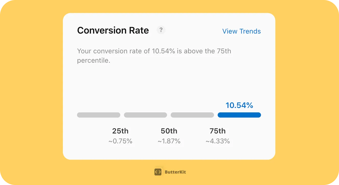
ButterKit conversion rate on the App Store in September 2025 (Source: App Store Connect > Analytics > Benchmarks)
User Behavior to Keep in Mind
Before diving into design techniques, it helps to understand how users actually behave on the App Store. These research-backed insights shape every recommendation in this guide.
Time to judge
People form stable visual appeal judgments in as little as 50 milliseconds, and these snap judgments don't change with longer viewing time.3
Never scroll through
Nearly 90% of App Store visitors never scroll through all your portrait screenshots. Your first 3 carry almost all the weight.45
Tap "read more"
Almost nobody reads your app description. Your screenshots must carry the entire message on their own.1
Scroll the gallery
The vast majority of visitors see only the first visible screenshot(s). The average scroll rate is just 17%.2
Reach screenshot #5
Scroll depth drops off steeply. If it's not in your first 3 screenshots, most users will never see it.4
Lift from reordering
Some apps gained a 16.6% install lift simply by putting the most explanatory screenshot first.5
Structuring Your Screenshot Story
Start with the problem
Products are simply solutions to problems. Your first 2 screenshots should prioritize the problem you’re solving and answer the question “what problem does this app solve for me, the user?”
Example: “Tracking your favorite TV shows got complicated. My app makes it easy.”
Use features as the solution (heroes in your story)
Feature A: See where to watch your favorite shows, anytime
Feature B: Automatic notifications when new episodes air
Think of your screenshots as a storyboard
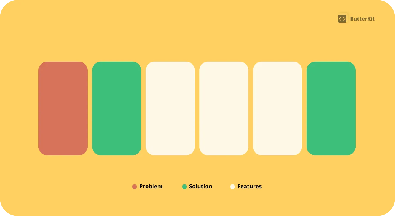
Your screenshots tell your app story
Social Proof
When a user is browsing the App Store and sees your screenshots, they’re not just evaluating features, they’re also asking (implicitly): “Are other people like me using this? Do they trust it? What does my social group say about this?” Because our brains are wired to pay attention to what others are doing, you can leverage this via social proof cues.
Social psychologists have long known that human beings often make choices about what to think, and what to do, based on the thoughts and actions of others.
— Robert Cialdini, Professor of Psychology in his paper about the science of persuasion6
Include customer quotes
Customer reviews/quotes are effective social proof, include them early in your screenshots and let your users tell your story. It’s more reputable and trustworthy than saying it yourself.
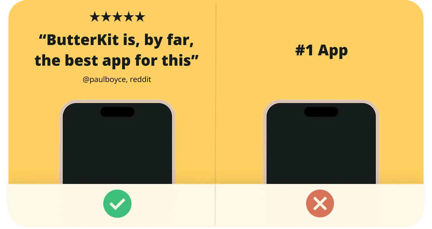
A positive customer review immediately builds trust
Examples:
- Positive reviews from real users who give permission to be included in marketing materials
- Number of downloads (e.g. “Used by over 500 developers”)
Highlight awards and news coverage
Including any awards your app has received, or any news/blog coverage (with permission) establishes trust and legitimacy.

Prioritize sources your audience may recognize
Visual Design Principles
Use fewer colors
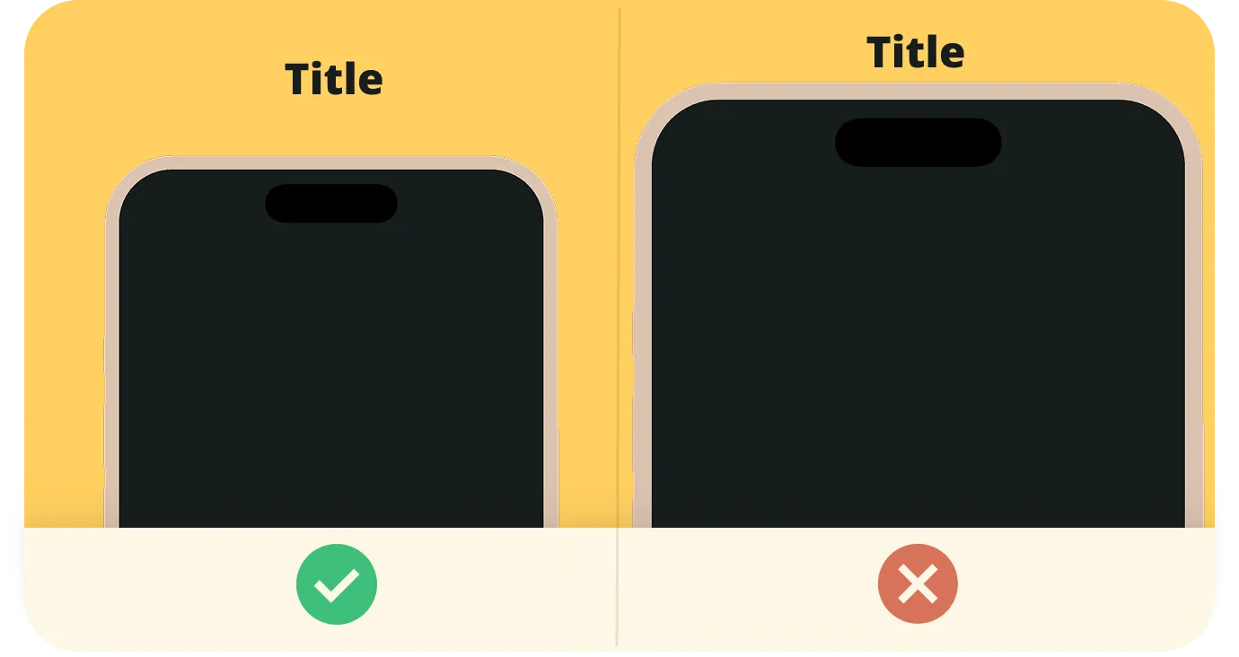
Stick to a strict color palette that reinforces your app/brand. One of the most common design mistakes I find in App Store Screenshots is too many colors and inconsistent typography, causing the design to feel overwhelming and inconsistent.
Use fewer typographic styles
If you’re using a traditional design tool, lean on “Styles” or reusable typographic settings to keep things consistent. A good rule of thumb is to have a Title, a Subtitle, and (optionally) a smaller Caption. More than those 3 styles is likely too many.
“Negative space” is a positive thing
It can be tempting to make everything as large as possible. However, “negative space” (aka padding, or breathing room) is what brings focus to your design. An example I think about a lot: how a single chair on an empty stage demands your attention.
"Negative space" or breathing room leads to a more focused and polished visual design
Keep it simple
In the UX design field, a common rule is Miller’s Law7 which states that the average person can only keep 7 (plus or minus 2) items in their working memory. And some recent studies have shown human attention spans shrunk from 2.5 minutes to just 45 seconds.8 Keep this in mind with your visual design and avoid overwhelming users with too much information at once. Limit each artboard/screenshot to 1 focus.
Consistency is key
In general, keeping your design consistent will make it more effective. This is true of the visuals, and your storytelling. Reinforce consistent colors, typography, layout, and storytelling to achieve the highest conversions.
Avoid slop
It can be tempting to turn to quick and cheap image generators (I’ve made this mistake myself), but users can tell. The internet is filled with low-effort slop. But this is an opportunity for genuine, high quality content to stand out above the rest. Giving your design a human touch will remind people it’s real.
Consider using a high quality template
Even if just as a starting point, a well-designed template will help structure your story and create visual consistency. ButterKit templates are professionally designed in-house and are provided for free. They are easy to use, intuitive, and designed to help you reach more users and tell the story you’ve worked so hard to build.
App Store Design Checklist
14 science-backed steps to maximize your App Store screenshot conversion rate
- Start with the problem your app solves in the first 1-2 screenshots
- Present features as solutions to that problem
- Structure screenshots as a storyboard with a clear narrative
- Include social proof early (reviews, download counts, awards, press)
- Limit color palette to reinforce your brand
- Use no more than 3 typographic styles (title, subtitle, caption)
- Add generous negative space for a focused, polished feel
- Limit each screenshot to 1 focus point and be ruthlessly concise (shorter is stronger)
- Keep colors, typography, layout, and storytelling consistent
- Use real design (avoid AI-generated slop)
- Consider starting from a professionally designed template
- Put your 3 most compelling screenshots first (nearly 90% of users never scroll through all screenshots)
- Show actual app UI inside device frames
- Translate and localize screenshots for each target market’s language and cultural context
Common Questions About App Store Screenshots
How many App Store screenshots should I use?
Apple allows up to 10 screenshots per device size. Use all available slots to tell a complete story, but front-load your most compelling screenshots in the first 3 since many users never scroll further.
What are the correct App Store screenshot dimensions?
For iPhone, the primary sizes are 1290×2796px (6.7-inch) and 1242×2688px (6.5-inch). iPad requires 2048×2732px. Apple accepts both portrait and landscape orientations, but portrait performs better for most apps.
Should I show the app UI or use lifestyle imagery?
Show actual app UI inside a device frame whenever possible. Users want to see what they’re downloading. Lifestyle imagery can supplement your story, but it should never replace real screenshots of your product.
How often should I update my App Store screenshots?
Update screenshots with every major feature release, seasonal promotions, or when your conversion rate drops. Testing new screenshot designs quarterly is a good baseline. Tools like ButterKit make it fast to iterate on designs and upload directly to App Store Connect.
Do App Store screenshots affect search rankings?
They significantly impact conversion rate. Higher conversion rates signal quality to Apple’s algorithm, which can indirectly improve your visibility and ranking. Some recent research suggests the App Store may index keywords visible in screenshots via OCR, but this is disputed and not official.
Are there tools that make this whole process easier?
Time for a shameless plug: that’s exactly what ButterKit does. I built it because I was spending entire weekends in Figma manually resizing screenshots for every device and language. ButterKit handles the device framing, backgrounds, text, translations, and uploading to App Store Connect so you can focus on the actual design instead of the busywork. It bakes in the science from this guide so your screenshots look great by default. You can also compare popular tools to see what works best for you.
- SplitMetrics / Bamboo Apps, SKODA Little Driver A/B test: "SplitMetrics sees only 1% of users reading the full description across all experiments." Link ↩︎
- SplitMetrics / Bamboo Apps, SKODA Little Driver case study. Link ↩︎
- Lindgaard, Fernandes, Dudek & Brown (2006), "Attention web designers: You have 50 milliseconds to make a good first impression!", Behaviour & Information Technology, Vol. 25, No. 2, pp. 115-126. Link ↩︎
- SplitMetrics, Apple screenshot scroll-depth analysis across 1,800 A/B tests. Link ↩︎
- SplitMetrics / Bamboo Apps, published on Sensor Tower's blog. Link ↩︎
- The above quote is excerpted from Robert Cialdini, Regents' Professor of Psychology and Marketing at Arizona State University talk in his research paper about the science of persuasion released January 3, 2007. ↩︎
- Miller's Law is defined in the Laws of UX published by Jon Yablonski. ↩︎
- The above data is sourced from Cyrus Moulton's article published by Northeastern University on January 23, 2024. ↩︎