The new ButterKit icon and brand
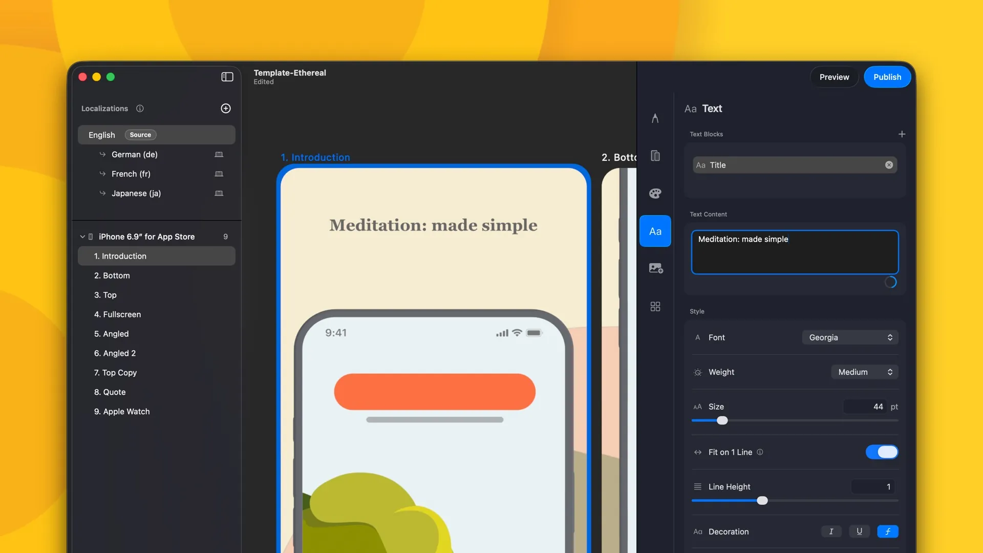
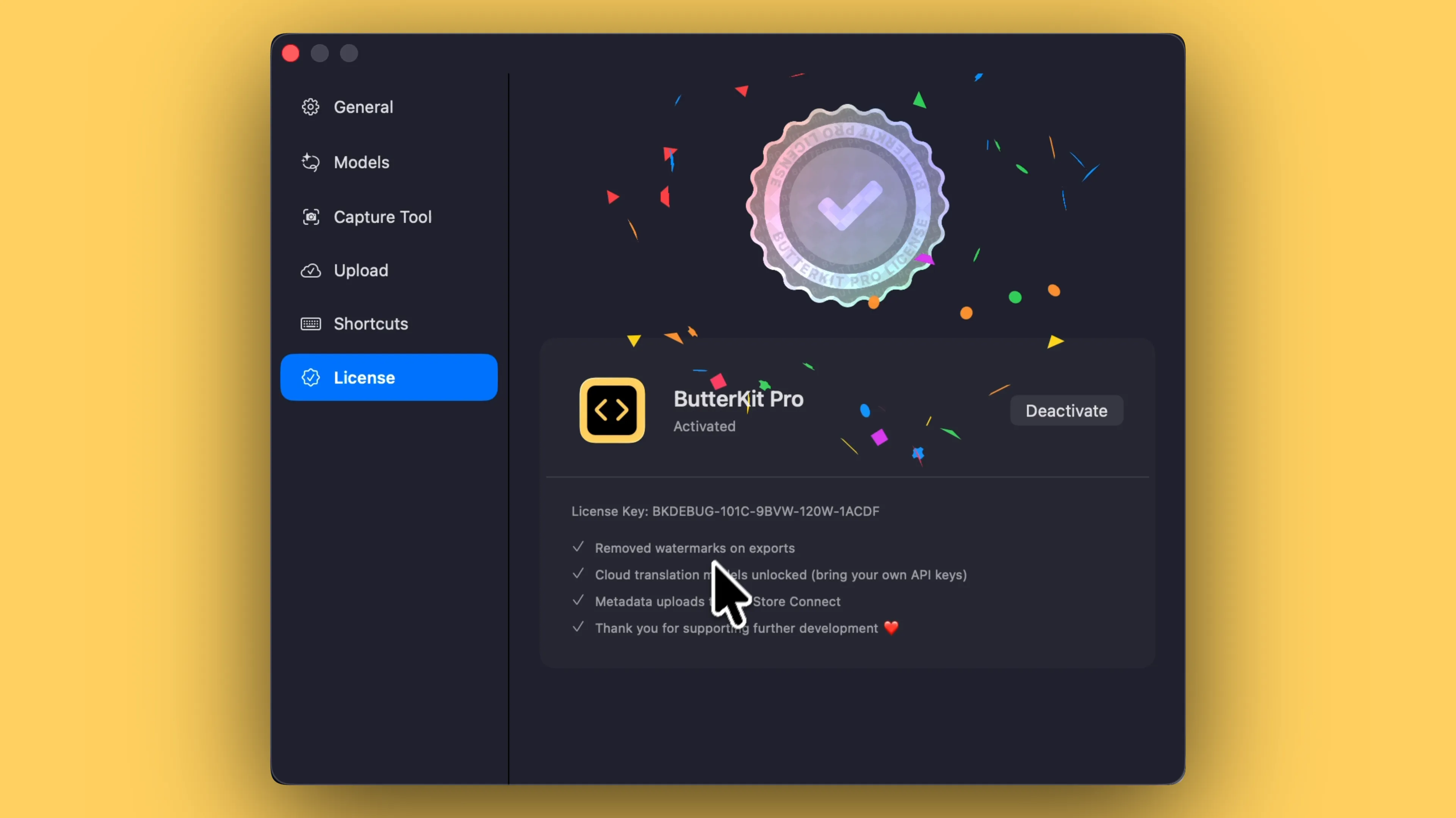
ButterKit has changed a lot since it launched! New features, hundreds of improvements, and now macOS 27 support. It was time for a new look to match: a new logo, wordmark, and color palette built around one idea: simple ingredients, iterated on repeatedly, produce something that rises.
What's in this release
NEW New Features
- New app icon. The layers stacked and climbing to the right. It replaces the old icon across macOS, the website, and the App Store.
- Improved wordmark built for warmth at large sizes.
- Refreshed color palette built from one material at different depths. Light mode runs from Cream through Butter to Crust; dark mode toasts everything down to Oven, Low Flame, and Milk. Every surface got a little warmer.
- Refined website: new light and dark modes, consistent color palettes, and mobile improvements.
FIX Bug Fixes
- All in-app branding surfaces updated to match the new identity. Your documents, templates, and exports are unchanged.
Full Release Notes
ButterKit has a new visual identity. It’s something I’ve been sitting on for a long time and felt ready to share. The idea is that simple ingredients, folded repeatedly, produce something that grows and rises. The new color palette is butter at different depths, and the wordmark finally has a typeface that feels as warm as the tool itself. It also sets up the brand for more tools in the near future ;)
Nothing about how ButterKit works has changed. Every document, template, and export carries over exactly as before. You will just notice things feel warmer when you open the app.
Smooth shipping,
-Zach